Perfecting the payment journey
Embank Fintech app
![]() PROJECT DESCRIPTION
PROJECT DESCRIPTION
We focused on ‘transferring money to another person’
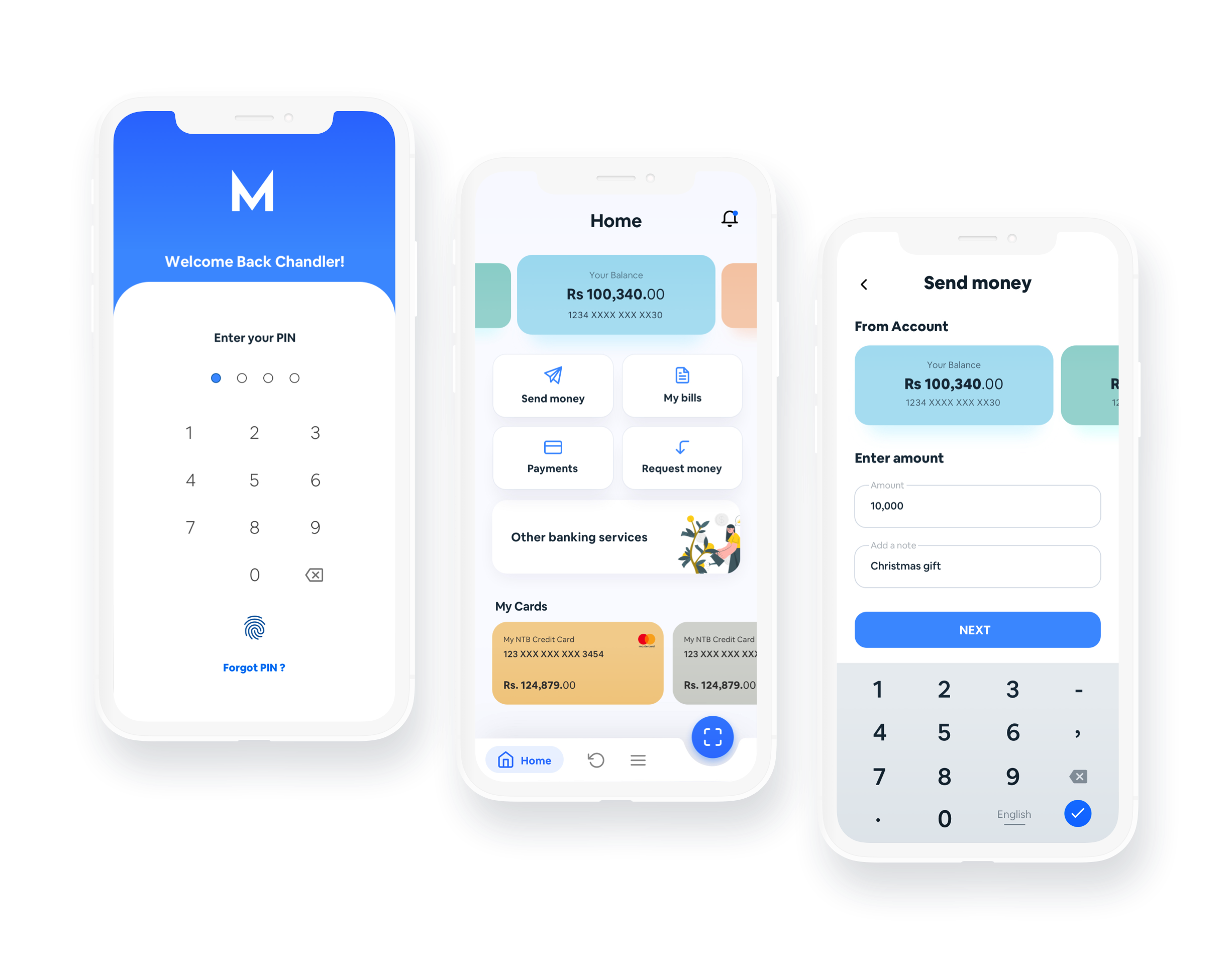
Embank is a bank app that was designed to cater the needs of a wide variety of users. What’s special about this project was this was done in collaboration with another designer and completed remotely. We collaborated together from start to finish of the project and stuck to a timeline of 7 days. The goal is to make both the younger and elder generations feel independent and empowered to use this app on their own.To keep the project simple and stick to the timelines, we focused on the scenario ‘transferring money to another person’.
Project Timeline
1 Week
![]() PROJECT RESPONSIBILITIES
PROJECT RESPONSIBILITIES
2 Designers equally collaborated in each phase
2 Designers worked on this project. The workload was equally divided between the two and we collaborated on every phase of the project. The areas we covered are User research, Analysis, Competitor analysis, Forming the concept of the app, Identifying user flows, Information architecture, Wireframes, Visual design and Testing.
![]() 2 Designers
2 Designers
Analysis of other banking apps
![]() THE DISCOVERY
THE DISCOVERY
We obtained the initial ideas from observing and talking to close family members.
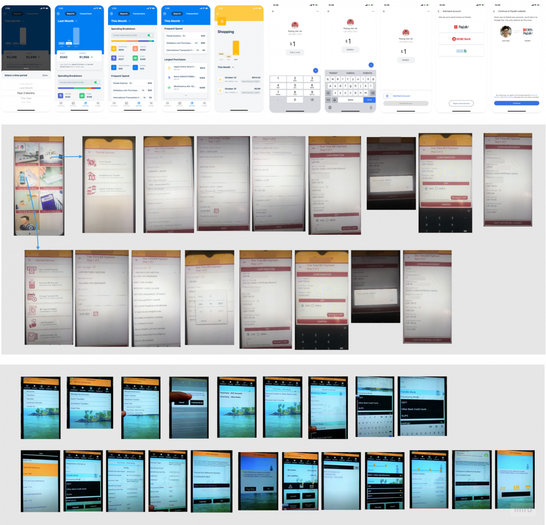
To understand the context better we downloaded some government and private bank apps, read reviews and watched videos of how to transfer because most required you to have a bank account with the bank. We took screenshots of the process and identified the most required information when transferring money to another person. Some of the apps contained more than 20+ screens and technical jargon. We wanted to cleanse all that make this app as seamless as possible.
Too many steps to complete
Having too many steps to complete before doing a transaction
![]() “Why so many steps? Maybe I should visit the bank”
“Why so many steps? Maybe I should visit the bank”
Technical jargon
Some banking apps have used technical and banking terms which the general audience will not understand.
![]() “What are CEFT and SLIP? What is a beneficiary?”
“What are CEFT and SLIP? What is a beneficiary?”
![]() THE CHALLENGE
THE CHALLENGE
“How might we make the payment journey as simple as possible?”
Due to the spread of Covid, many people are feeling helpless in transferring money to others because they are unable to visit banks due to reasons like lockdown, the spread of covid and other health issues. More than the younger community, the elder generation prefers physically visiting the bank due to the trust factor and because they are not tech-savvy. They are afraid of making mistakes and not being able to transfer money being in their comfort zone. So they prefer asking for help from someone who works at a particular company or someone with technical know-how.
When we empathized with them we figured that this leaves them feeling dependent and feel like they are indebted. If we could crack this we could empower them to make their own decisions. That would give them a good feeling. But these transactions don’t happen often. Either once a month or even rarely than that. So the app has to be extremely easy to use because people don’t like to keep things like this in their memory. We don’t want them to feel like technology is controlling them. We want to give the users the control of using the app to make things convenient for them.
![]() BRAINSTORMING
BRAINSTORMING
We used Miro to communicate about our research and write our ideas out. We first jotted down thoughts and discussed further on those points. And discussed the pros and cons of the decisions we are taking.
When we empathized with the problems the users were having, we figured that the main points were,
-
-
- The current bank apps that are mainly being used are confusing and difficult to use with many forms to fill
- There are numerous options to choose from
- There are technical words that they don’t usually use
- Have to remember how to use the app the next time
- There are many steps that can get annoying
-
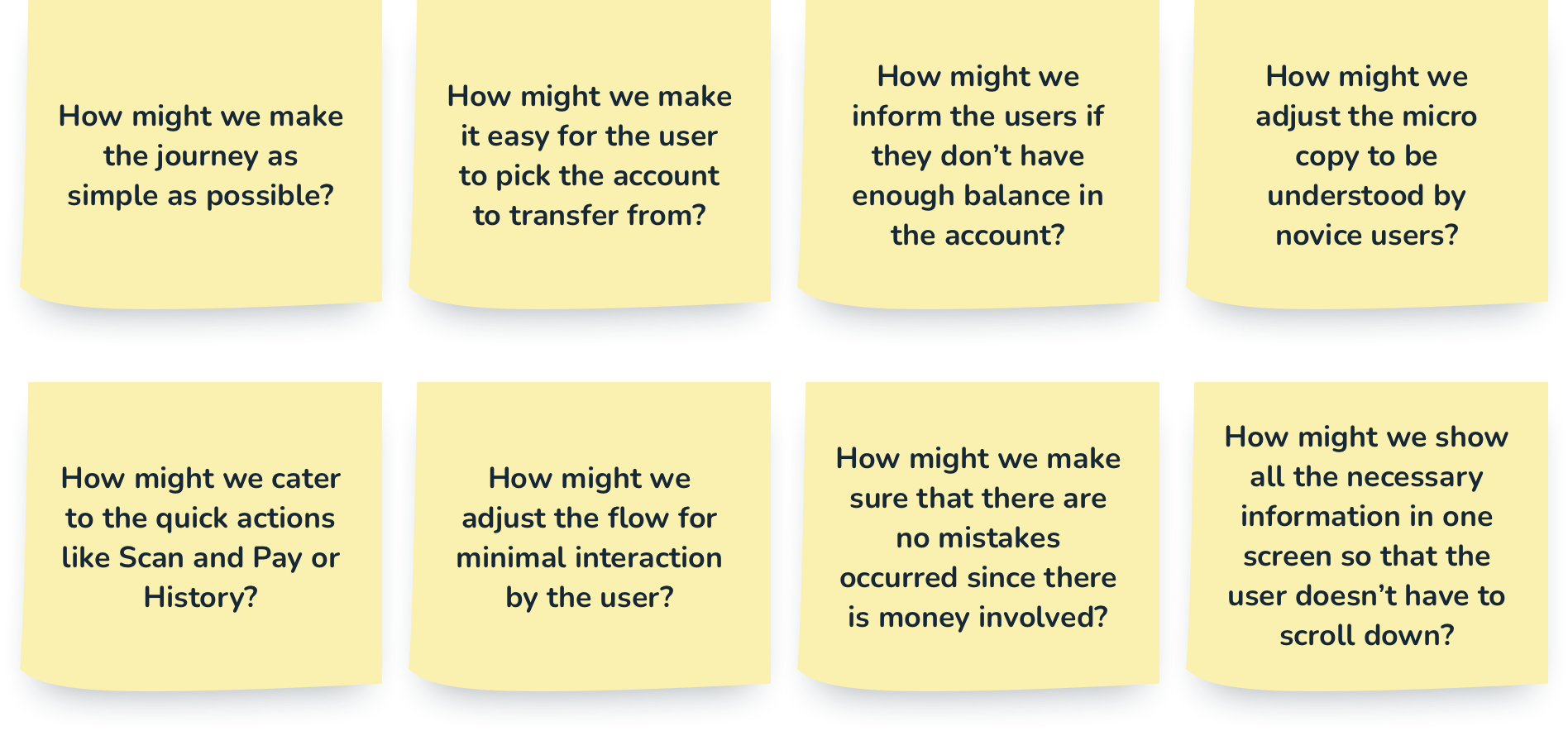
Then we created a list of How Might We questions when empathizing with the users
![]() SOLUTION BREAKDOWN
SOLUTION BREAKDOWN
Then we came to a conclusion that our solution would be
-
-
- With minimal steps possible
- Only request for required information
- Has to be useful for both novice and the expert (tech-savvy)
- Not overwhelm users with numerous options
- Learnable and users don’t have to remember how to use it the next time
- Include a confirmation screen before making the transfer
- Ask only for necessary information from the user
-
Since this is a task-oriented user flow, we wanted to keep the interfaces without any distractions as much as possible. We want the users to have a delightful experience while successfully completing the task at hand.
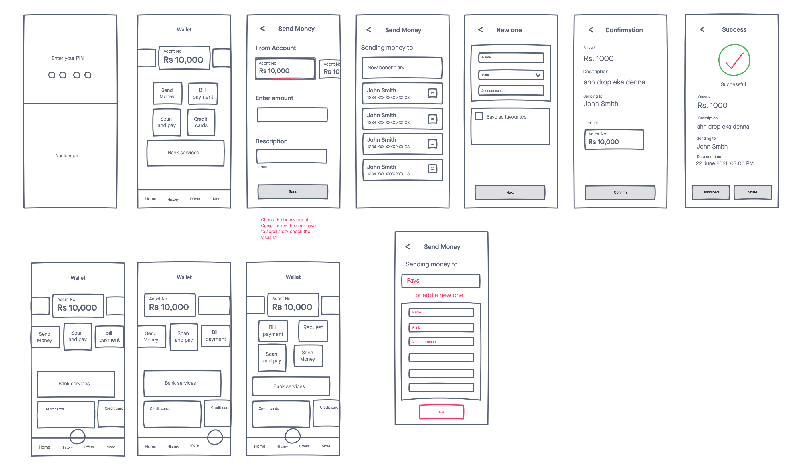
We first decided to work on the transfer flow and kept the dashboard to be done later. Mainly because it was a challenge itself. We needed to make sure that it caters to the vast majority of users and to make sure that it contains important information at a glance but only the necessary.
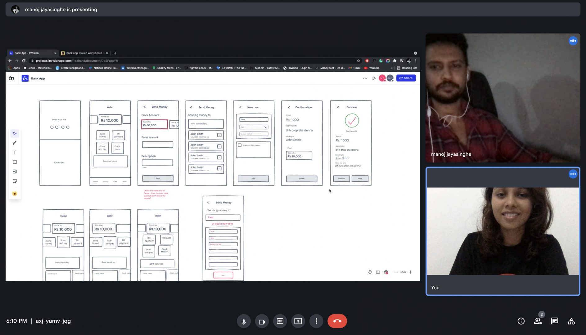
We drew the user flow of an existing user who wants to transfer money to another person on Miro. After finalizing the journey we drew low fidelity wireframes on the Invision freehand because it was the easier method to collaborate. Our aim was to simplify the user journey as much as possible.
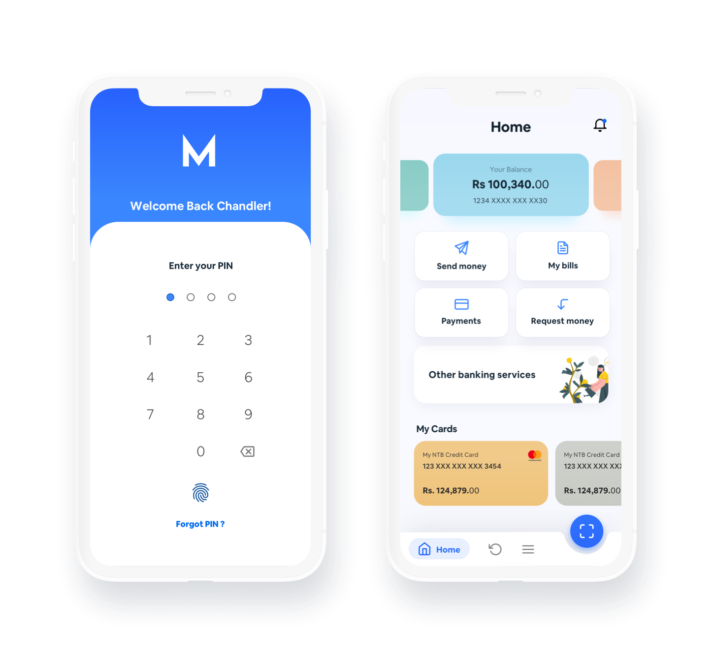
When we were designing the dashboard we concluded that we should show the bank accounts and their balances, and Call-To-Actions of important and mostly used features to lead them to relevant journeys. We also wanted to keep the microcopy as simple as possible because most people who don’t know banking or finance terminology might be confused. We also drew up different options for the dashboard. By talking through the pros and cons of each element and what their interaction would be to the users, we decided to pick this view for the dashboard.
-
-
-
- Before we started drawing the concepts we made few assumptions
- User already a bank account
- User know that they can transfer money through the app
- The user is already logged into the app
- The user is a returning user of the app
-
-
![]() WIREFRAMES
WIREFRAMES
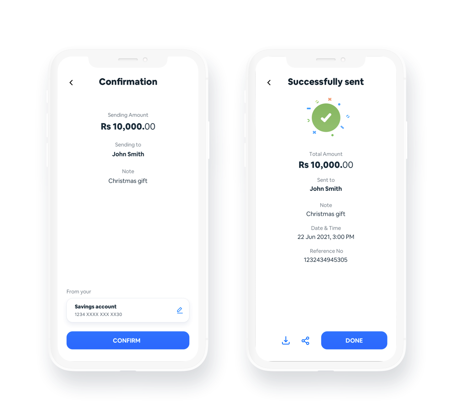
Low Fidelity Wireframes
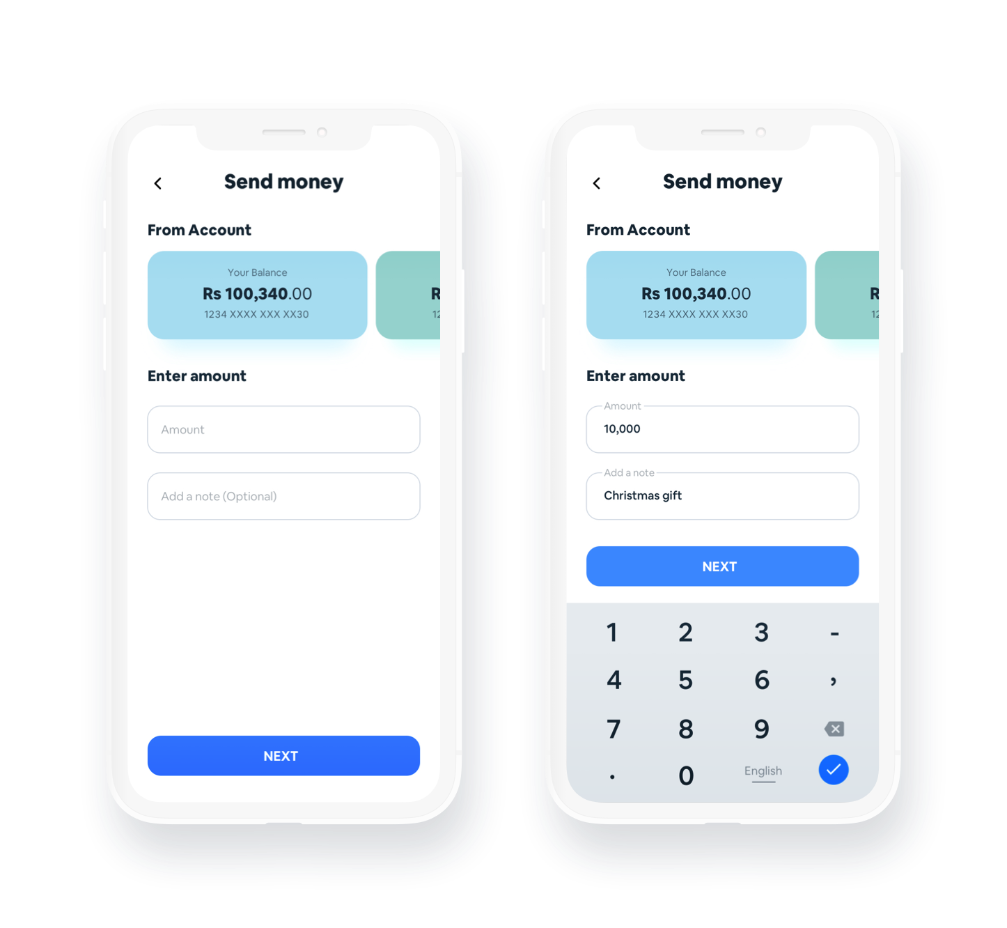
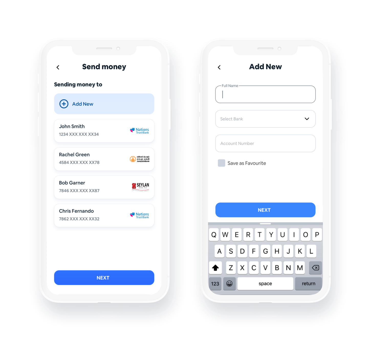
High Fidelity Wireframes
![]() TECHNOLOGIES
TECHNOLOGIES
“Collaborating tools played an extremely important role”
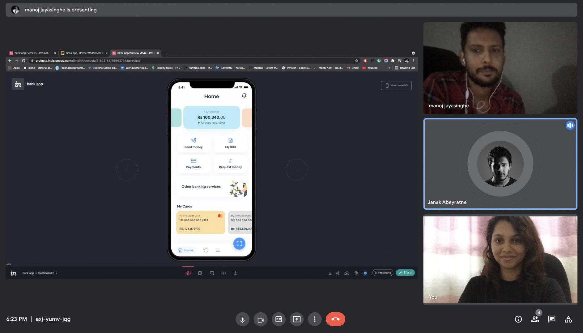
We used Google Meet for the team discussions. The discussions went on for 1 -2 hours every day till we solidified the foundations and the structure of the app. Then for the last stages of the project, we discussed points through Whatsapp on the action items. Then we came together to discuss the action items and make changes to suit both our ideas.
![]() VALIDATION
VALIDATION
We conducted this study as a fully online moderated interview
We conducted this study as a fully online moderated interviews with 5 participants who connected remotely with us.. All interviews were conducted as one on one sessions, within a time frame of approximately 30mins for a session. The results from the user testing turned out to be positive.
We asked the participants to provide an overall rating after the test. It was on a 7 point Likert scale. These are average of the ratings out of 7.
6.1 / 7
01. Usefulness
Whether the app is useful, saves time, meets their needs, does what they expect it to do
6.72 / 7
02. Ease
Whether the app is easy to use, user friendly and requires fewest steps possible
6.6 / 7
03. Learnability
Whether the app can be used without help, how quickly it took to learn and whether they remember how to use again
6.4 / 7
04. Satisfaction
Whether the participants and satisfied and would recommend to a friend
![]() RETROSPECTIVE
RETROSPECTIVE
“We had to balance our work and personal life also and see how we could work together”
Communication played an extremely important role in this project. There were many things we had to consider when doing a project like this remotely. We have to listen to each others opinion and provide feedback on them. We had to balance our work and personal life also and see how we could work together and keep the discussions going. We also had to empathize with each other while keeping the deadlines so that there’s momentum.
What we could have done differently
If we had more time, we could have tested with a diverse set of users.